SO…HOW DOES DESIGN affect readability? And how does writing affect design?
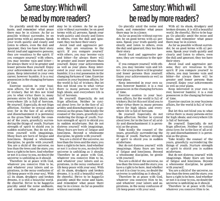
Take a look at the two stories in the illustration with this column. Which do you think will be read by more readers?

Well, the one on the right, of course!
The short paragraphs make that story more appealing because readers understand a simple truth about writing: Shorter is better.
Those same readers will see the story on the left as daunting. One glance and they’ll think they don’t have the time (or, perhaps, the attention span) to read that story. It just looks too long.
On the right, they’re given the story in bite-size pieces. On the left, the chunks are just too much to swallow. A reader could choke on the second paragraph…but there’s little worry about that because the odds are the reader won’t get past the first paragraph.
In fact, given the look (design!) of the story, most readers won’t even begin to read it!
The same is true of story length. Give readers a long story and you lose some of them the moment they look at it — no matter how excellent the writing.
Readers tell us they’ll give us about 12-to-15 inches for any story. After that, they quit. And, if we give them that long story without any visuals — even just a pullout or infobox — they’ll just leave more quickly.
Short paragraphs, using short words, in short stories.
Hmmm…what’s the recurring word here?
Gettysburg. 1863. The orator before President Abraham Lincoln spoke for two hours. Lincoln spoke for two minutes. Lincoln’s address will live forever as one of the greatest examples of clarity and brevity.
Do you know the name of the orator who went on for two hours?
I didn’t think so.
