Ed Henninger, design
ED HENNINGER is an independent newspaper consultant and the director of Henninger Consulting.
Website: www.henningerconsulting.com
Phone: (803) 327-3322
WANT A FREE evaluation of your newspaper’s design?
Just contact Ed: edh@henningerconsulting.com | (803) 327-3322
IF THIS COLUMN has been helpful, you might be interested in Ed’s books: “Henninger on Design” and “101 Henninger Helpful Hints.” With the help of Ed’s books, you’ll immediately have a better idea how to design for your readers. Find out more about “Henninger on Design” and “101 Henninger Helpful Hints” by visiting Ed’s website: www.henningerconsulting.com

In recent columns, I’ve listed text typefaces to toss and text typefaces I recommend.
Does it matter? Is the right text typeface — used in the right way — really that important?
Yes. It. Is.
Some reasons why:
EIGHTY PERCENT of the information readers glean from your newspaper, they get from reading text. Eighty percent … despite all the color, graphics, photos and other design elements you use throughout your paper.
AGING READERS. No need to go into any detail on this. We all know our readers are mainly elderly. Their greatest complaint about our newspaper’s design? Text that’s too small. Even when it’s way large enough, some will claim that it’s still too small.
READING SPEED. A good text font, used properly, is a plus for reading speed. Take the same good font and use it improperly, and reading speed slows. To put this into context, let’s look at …
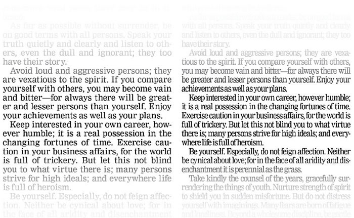
LEGIBILITY VS. READABILITY. The two terms are often used to imply the same thing, but they shouldn’t be. The term “legibility” applies to the design of the typeface itself. But “readability” applies more to how the typeface is used. Take a look at the illustration with this column. On the left is Nimrod, a highly legible text typeface that’s top on my list of recommended text type. On the right, the same Nimrod, but so squeezed and so tightly tracked that it’s just not readable. It doesn’t take much to make a good typeface unreadable.
CREDIBILITY. Yes, your text (and often your headline typeface) actually helps make your newspaper more credible. If readers can read your paper comfortably, if it’s a choice and not a chore, they’re going to believe you more readily and depend on you over time.
TEXTURE. The word “text” is actually taken from the word “texture,” implying that there’s an evenness, a color to your text. If it feels too dark, it also feels more difficult to read. Text that’s overly line-spaced can also be more difficult to read.
Take a look at your text type. Is it legible? Is it readable? Is it comfortable to read? If you underestimate the importance of text type, you’re putting the appeal of your newspaper at risk.
