Ed Henninger
Design
ED HENNINGER is an independent newspaper consultant and the director of Henninger Consulting.
Website: www.henningerconsulting.com
Phone: (803) 327-3322
WANT A FREE evaluation of your newspaper’s design?
Just contact Ed: edh@henningerconsulting.com | (803) 327-3322
IF THIS COLUMN has been helpful, you might be interested in Ed’s books: “Henninger on Design” and “101 Henninger Helpful Hints.” With the help of Ed’s books, you’ll immediately have a better idea how to design for your readers. Find out more about “Henninger on Design” and “101 Henninger Helpful Hints” by visiting Ed’s website: www.henningerconsulting.com

“Design is not just what it looks like and feels like. Design is how it works.” — Steve Jobs.
That’s it. In one brief sentence.
Of course, readers want a newspaper that looks right … and feels right. They want the look and feel of their paper to reflect their community.
But what they want most of all is for their newspaper to work right for them.
Ask readers, and they will tell you they want:
TEXT that is legible, with size and spacing that makes it comfortable to read.
DESIGN ELEMENTS like standing heads, section flags and columns sigs that are simple and clean.
CONSISTENCY of those design elements throughout the entire newspaper.
DISPLAY FONTS that are readable, crisp and appealing.
SHORTER STORIES that are written clearly and flow easily.
EDITING that makes those stories even easier to follow.
PHOTOS that grab reader attention because they have interest, information and impact.
PAGE STRUCTURE that makes it easier for readers to see what goes with what.
SPACING between packages that helps readers see that structure.
COLOR USE that makes sense.
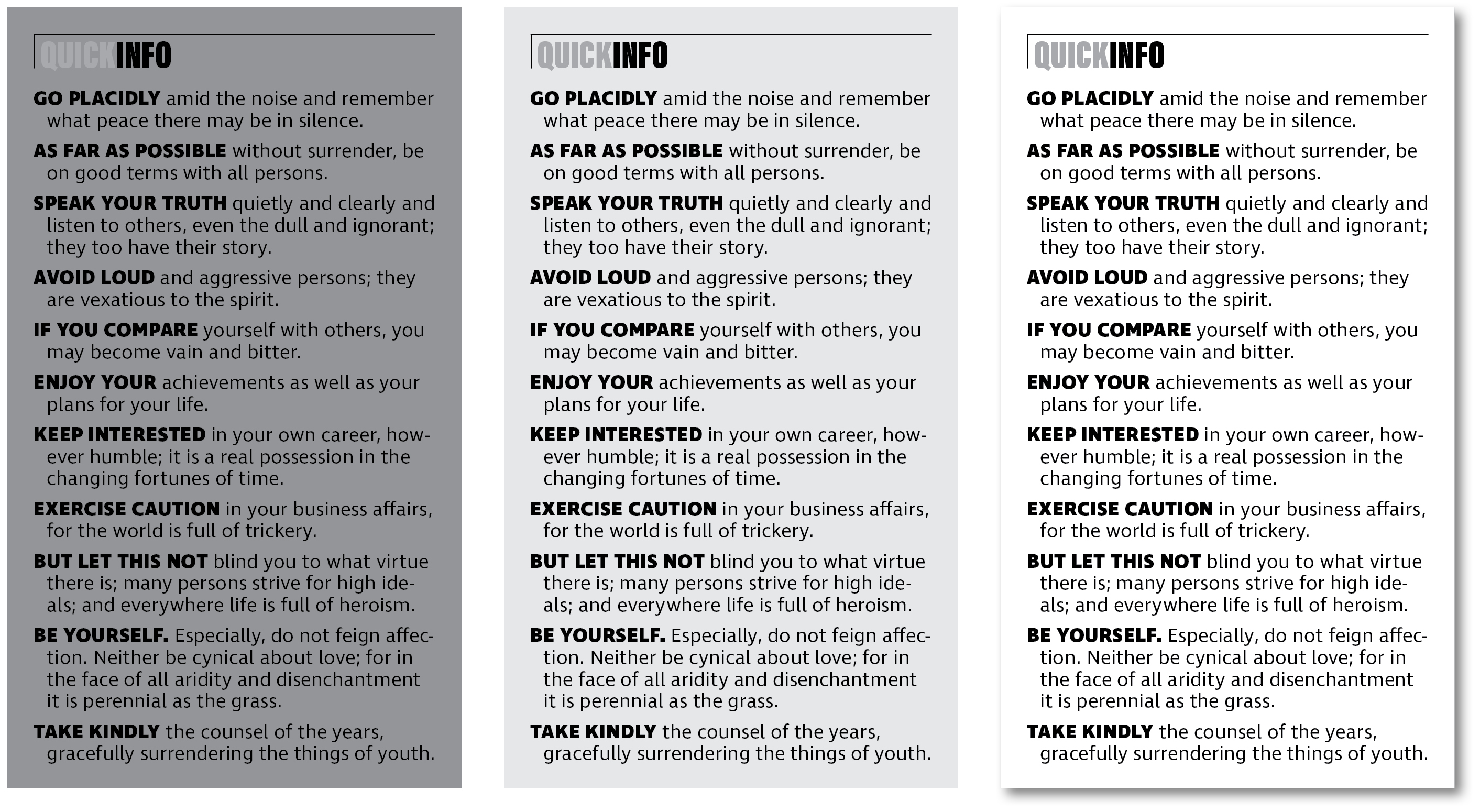
TINT BLOCKS that add impact — but don’t make type difficult to read.
SEQUENCING that makes the different content areas of your newspaper (e.g., news, opinion, sports, features … ) easy to follow.
CONSISTENT placement of that content from issue to issue.
We can give readers all of those. And, in the process of doing that, we can rid our newspapers of those elements that create clutter and confusion.
If we start with how design works, it just makes sense that we’ll create a better design.
