Ed Henninger, design
ED HENNINGER is an independent newspaper consultant and the director of Henninger Consulting.
Website: www.henningerconsulting.com
Phone: (803) 327-3322
WANT A FREE evaluation of your newspaper’s design?
Just contact Ed: edh@henningerconsulting.com | (803) 327-3322
IF THIS COLUMN has been helpful, you might be interested in Ed’s books: “Henninger on Design” and “101 Henninger Helpful Hints.” With the help of Ed’s books, you’ll immediately have a better idea how to design for your readers. Find out more about “Henninger on Design” and “101 Henninger Helpful Hints” by visiting Ed’s website: www.henningerconsulting.com

During the past few years — and only for certain clients – I’ve been suggesting that they get away from the traditional half-point frame for photos.
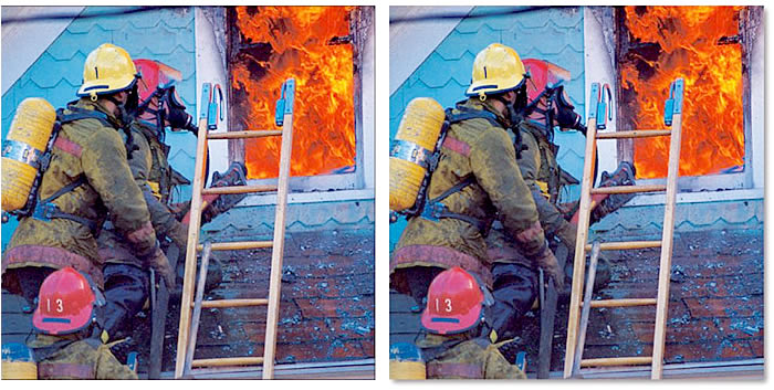
The option I recommend is a photo frame with a soft drop shadow.
Why?
A few reasons:
IT’S DIFFERENT: Not many other newspapers use this approach, so the new look makes you stand out, especially if you’re in a community where you’re competing against another paper. It’s certainly an idea to consider if you want to redesign.
IT’S APPEALING: Readers might not be able to articulate the difference, but the soft shadow tends to make your photos just a bit more friendly, more comfortable to look at
.
IT’S MORE ‘FEATURISH’: Some editors might think that the soft shadow takes away from the impact of a hard news photo, such as a fire or an auto accident (or the mug shot of a serial killer!). That’s OK. You can drop the soft shadow on such photos if you wish. But for most photos in community newspapers, a soft shadow frame will do just fine.
IT’S THREE-DIMENSIONAL: The soft shadow helps push the photo off the surface of the page, giving the photo a bit more impact. The half-point frame doesn’t do that.
Here’s a suggestion: Try the drop shadow look on an upcoming photo page or in a special section. See how it looks to you. Does it give you a feel you’d like to see throughout your entire publication? If so, you know what to do.
And another suggestion: Don’t use the InDesign default specifications for the shadow. Those specs create a shadow that’s too dark, too big.
Here are the specs for the shadow on the photo at right above:
Blending mode: Multiply
Opacity: 50%
Distance: Ignore. Offsets will create distance.
X Offset: 0p3
Y Offset: 0p3
Angle: 135º
Size: 0p5
Disregard other options.
One last detail: If you’re placing a photo with a soft shadow at the right edge of the page, be sure to nudge it left about a pica. Otherwise, the shadow might fall out of the print area, leaving you with no shadow at all.
The soft shadow photo frame can give your newspaper a more comfortable, more friendly design. It’s worth a look.
