Ed Henninger, design
ED HENNINGER is an independent newspaper consultant and the director of Henninger Consulting.
Website: www.henningerconsulting.com
Phone: (803) 327-3322
WANT A FREE evaluation of your newspaper’s design?
Just contact Ed: edh@henningerconsulting.com | (803) 327-3322
IF THIS COLUMN has been helpful, you might be interested in Ed’s books: “Henninger on Design” and “101 Henninger Helpful Hints.” With the help of Ed’s books, you’ll immediately have a better idea how to design for your readers. Find out more about “Henninger on Design” and “101 Henninger Helpful Hints” by visiting Ed’s website: www.henningerconsulting.com

A reader emailed to mention that I’d recently written a column listing New Century Schoolbook (among others) as a typeface to toss, but that I hadn’t suggested a text face that might be better.
Good point. So, this column will focus on text typefaces I can recommend. It’s not a long list, and you might have a text face you like that’s not on my list. If so, send me a quick note and I can share some thoughts with you about your preference.
Here are my suggestions:
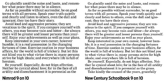
NIMROD. It’s just a bit more condensed than many other text types, but Nimrod has superior x-height and a stroke weight that borders on perfection. It’s the one typeface to which I compare all others. When I hear others ooh and ahh about a new text typeface, I immediately get access to that face, then do a test comparing it with Nimrod. And every time … every time … Nimrod still comes out larger and easier to read. The illustration with this column that compares Nimrod with New Century Schoolbook is a typical example. After 27-plus years as a newspaper consultant, I still recommend Nimrod first.
UTOPIA. Designed in 1989, Utopia has excellent stroke weight for use on newsprint. It’s easy to read and — like many superior text types — calls little attention to itself.
GEORGIA. I heard recently that another consultant said, “You should never use a typeface named after a place.” I’ll disagree here. A good thing about Georgia is that you probably already own it. It’s a good text face and I’ve used it in several redesigns.
CHELTENHAM. Originally designed more than 120 years ago, Cheltenham is highly readable, with excellent stroke weight. It’s a bit small, but used at the correct size, this is a face that will be a comfortable upgrade for your readers.
CENTURY OLD STYLE. It’s more condensed than Century Schoolbook and has a more newsy feel to it. Good balance in stroke weight in many of its characters and a larger x-height than some other text fonts.
BENTON MODERN. I really prefer this for display, but Benton Modern has one clear advantage over many other text faces: four different weights. Though they’re almost unnoticeable, those weight variations can work to your advantage. Which weight is best? You won’t know until you test them all on your press.
MILLER TEXT. Very traditional looking, Miller Text is just a bit too wide for my taste, but its classic proportions make it a delight to read.
One text face that will never make my list is Times. It’s too tiny and its stroke weight isn’t as uniform as the fonts mentioned above. Though many newspapers still use Times for text, I’m doing my best to make them rethink that!
I suspect that there are other text faces that might be just as good — even better — than some I’ve listed. What are you using … and should I add that typeface to the list?
